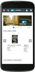
Sales and Search Results – Opportunities for eCommerce with Responsive Mobile Design
A website with responsive design adjusts to the sizes of all devices shoppers are using, naturally providing optimal presentation. For a web store, the result is a single cart that functions for both PC and mobile, with a similar look and feel, regardless of device size, no longer requiring multiple web sites. This means a better shopping experience for your users, which can translate to more sales and higher search rankings.
The alternatives to responsive design are dynamic serving or maintaining a separate website for mobile shoppers. Dynamic serving uses different HTML for different types of devices, so when users search for information, results for the same site are shared between different versions of HTML. Hopefully, a mobile site using dynamic serving is set up properly; otherwise, Google might not even find the mobile content. Maintaining a separate web store for mobile shoppers is (at least) twice the work as having a single online web store. Each supported device requires a separate web site. Otherwise, it might not display properly to mobile users, increasing the number of people who leave the website after visiting only one page (raising bounce rates), and risking loss of would-be customers to frustration. If your site is awkward for mobile users, you could be decreasing your own search results and sales.
 Responsive design eliminates these concerns. It is more cost-effective and easier to manage than maintaining two separate websites, it uses the same HTML for all devices, and it provides a better experience for users who switch between devices and for those who share links to websites. It is also Google’s recommended design for all devices
Google can more efficiently index your website if it uses responsive design, and it isn’t necessary to redirect a URL, which doesn’t increase the time it takes to load your website. In addition, responsive design provides a better experience for all users. Font sizes have a consistent appearance, so users don’t have to work hard to see the content (no double-tapping or pinch-to-zoom necessary), and links are large enough for fingers to use accurately.
There is a lot of research to support the decision for responsive design. According to a survey by Signal, 85% of respondents plan to shop using PCs or laptops, 67% plan to browse more from phones or tablets, and 60% plan to buy more from phones or tablets than they did last year. And according to this article, 75% of adult internet users have two or more devices for online use, and 67% switch between devices them, so responsive design is a sound business decision.
For details about InOrder’s responsive mobile design, or for a demo of InOrder eCommerce, contact Morse Data Corporation.


No Comments